Sunday, 27 September 2015

GOOGLE IMAGERY AND COLOR

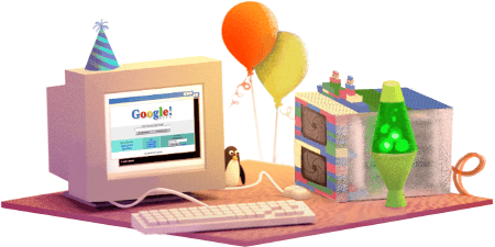
Google's 17th Birthday


Google's 17th Birthday


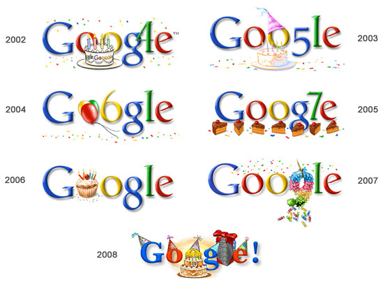
After looking at some of my favorite google decorations with lettering and imagery , that Google have used too decorate the word. i think that this is an amicable and relay exciting way of delivering an fun, pleasing and good stint on the search bar of Google.

The comic approach to some of the imagery used along with Google's traditional color's with the lettering is relay fun. this in turn helps the user remember google search engine. The uses there for is more inclined too use this search engine.

i like the simplicity but also the layout and fount of the lettering and imagery combined. this in my opinion makes the whole word and imagery well rounded.

Saturday, 26 September 2015

A Pepsi

Image result for pepsi logo
This is an example of the earlier "Pepsi" logo. I like this as it uses four different colors, they stick out. the color variation is working hand in hand to make this as eye catching as possible. I like this as the logo is not to busy. the way that the colors are matched up are working together relay well.

I like the fact that the two outer colors make the border for the circle to sit in to. The thing which I think makes the whole look distinctive is the way the white is used as the background, also as the circle for the logo. the positioning of "Pepsi" is rely clever as it the lettering is sticking out of the white. this makes the whole logo round.

Friday, 25 September 2015

Birds Eye


This adverts is well constructed, as well as marketing it memorable to the viewers. The advert uses a bear for the commercial which is unique to the brand. The tone of voice that the bear uses makes you want to buy the product. 

The package for the product is relay eye catching and visually pleasing. i like the way that the packaging only uses the different colours, but the same colourer is used in different shades. The green for example has lots of different shades within the packaging.


The green righting on the white background works relay well. The green packaging and the writing stick out relay well. The clearness of the whole advert is clear from a distends due to the crisp clear back ground.


Thursday, 24 September 2015

Paul Smith


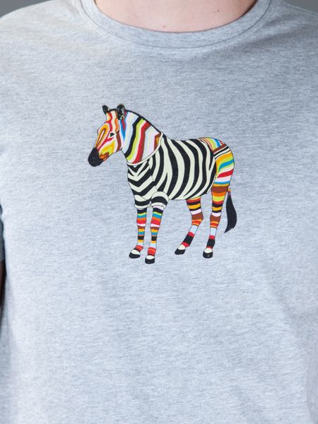
This iconic peace of work by Paul Smith is very eye catching and unique to Paul smith. With this piece of work you can tell strait away that this is Paul Smiths work. He uses this coloration on clothing logos.

I find this very inspiring to look at, this is a fine example of how different colors work well together to make such an iconic and eye catching peace of work. This work is so diverse and unique, yet it will go with about almost anything. This patent can be implemented into different patterns on tops.


The way he has used the stripy pattern on the t shirt is a really clever way of conveying an iconic pattern and using it to its very best. I like this as it’s unique to the Paul Smith brand. The stripe pattern in a design used to color in the pattern raver than just using soled colors to colors in a design in is really inspiring and eye-catching as well as cool to look at. 


Wednesday, 23 September 2015

Your World: British Gas


The British Gas advert Your Wold is one of my favorite adverts. This advert goes hand in hand on what gas and electricity dose in the real world. The advert in this scene is coherent and puts a fun and interesting slant on a real every day utility. 


The fact that the advert is an animation, makes the advert more memorable. This will make the potential consume want to by their gas and electricity from British Gas.
Also on the advert British Gas have been very clever and used a really well known band called Blur. One of their well-known songs ‘universal’, this song is very memorable which will also help the parental clients remember the British Gas advert. When someone who has recently watched the British Gas advert or listens to Universal by Blue, they will instantly remember the advert.