Sunday, 13 December 2015

humble oats

Sainsbury's porridge:


 0 (3)
http://www.tvadmusic.co.uk/tag/sainsburys/page/2/

The humble bowl of porridge, that a Sainsbury's porridge. I think that this is a really cleaver advert, the porridge lovers can have pa pack for £1.20. The imagery is spot on so is the colour. The typography used is really eye catching and blends in well with the background. After seeing this it makes me want to have a bowl of porridge.

THE FRAGANTICA WEBSITE

Fragrantica:

Fragrantica 1

http://www.q8blend.com/fragrantica/fragrantica-1/

Fragrantica is the perfect website to up load images of aftershaves and perfumes. The website offers you the chance to give a review on a product you have purchased. I like the website because i can get peoples opinions on a aftershave before I get it.

The imagery and founts used on the website are really good and eye catching. also the website is easy to use and navigate around. A well worth visit to the website before purchasing aftershaves or perfumes.

supermarket pricing

supermarket pricing:

0

Sainsbury's or Tesco's which price is more?... well in this advert the price is the same.

Yes you have guest it, the same price comparison adverts from the two of the four major supermarkets. this time Sainsbury's and Tesco's.

I like these type of adverts, i can see where the cheapest is and go shopping there.

1 Million


http://www.fragrantica.com/news/Paco-Rabanne-1-Million-Intense-3993.html

From the gold box, to the gold bar bottle. this E.D.T spray souts out class. I love the sent of this product its one of my favorites. the number one is so eye catching and distinctive. with the motif scrolling underneath. The bottle and the box both shout out and stick out and say i am classy.

the iconic bottle

the iconic bottle:

Jean Paul Gaultier Le Male Aftershave Splash for Men 125ml
http://shop-chemist.co.uk/product/jean-paul-gaultier-le-male-aftershave-splash-for-men-125ml/

This beautiful Icon bottle and tin is so eye catching. this is what you called Packaging design brand identity. I really like this because Jean Paul Gaultier is the only aftershave to offer a bottle in a tin.

The torques color of the bottle with lines going around is a really nice touch. i make you the user want to use the product.

candy crush game

Candy Crush:

candycrushsagapng -
http://www.videogamer.com/news/candy_crush_sagas_statistics_are_mind-boggling.html

Candy Crush Saga, on of the most played games on Facebook. the game is really addictive. the sweets on the grids as the fall and the buzz you get when you pass each level. The graphics are good and the colour variation, with the movements are really eye catching. making the game addictive and leaving the play wanting to play. so the can keep progressing to the next level.

i used to play this game all the time, the game is full espasualy when you keep completing level.  


J.P.G logo typography


typography for J.P.G logo:


Jean Paul Gaultier Logo
http://logonoid.com/jean-paul-gaultier-logo/

This iconic yet remarkable brand identity is very unique. I like the fact that the name 'Gaultier' is diagonal positioned and over lapse name 'Paul', its eye catching and i have only seen the sort of typography used by Jean Paul Gaultier.


PLAY: the limited Lynx can

Limited addition lynx can:


Michael kleinman along side designer Jae Jun Kim produced this wonderful and very pleasing, limited addition can of lynx.


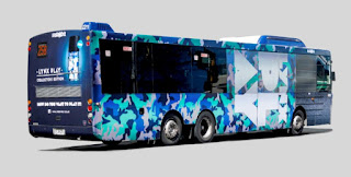
That beautiful pattern, from the can's, have hit the buses, in the form of bus raps.

 The cool design for the can of lynx was also used for bus raps. I really like the bus raps I makes you want to go and by a can of this beautiful looking lynx. The coloration is just amazing and eye catching and fun to look at. 


Limited addition lynx can p2:

Typography:


The slogan behind the can of lynx was this ( the typography image above). Which is iconic and memorable slogan which an easily be associated with this can of lynx. I really like the typography, it unique and fun. The white text and the light torques blue go really well together.


Limited addition lynx can p1:

Limited addition lynx can:


Michael kleinman along side designer Jae Jun Kim produced this wonderful and very pleasing, limited addition can of lynx. This is such a cool can of body spray, i think there has not been a can that has been this iconic before. i really want a can of this Lynx.  

Lynx packaging:

Lynx packaging:


http://axecollections.wix.com/home#!Lynx 2012/zoom/c199t/imagevfs 

This is really good package design, I like this design because it’s simple, but it also catches you eye and attention. I like the fact the can used a black back ground with yellow righting. The use of typography is really good and eye catching. I like the fact that the ‘2012’ is positioned in the grove of the can. The fact that this has a yellow background along with black numbers. The opposite to the main body of the can, makes the deodorant can all together more impressive.  

The lynx audience:

The lynx audience:


The tone of voice that lynx is using is aimed towards the younger male. The adverts are really appealing. I like the fact that the deodorants and other lynx products, have the idea of their products ‘attract female attention’. I think this is a good idea that lynx have got. It’s there unique selling point.

This also good brand identity because if someone hears this slogan on the T.V radio or reads the in a advert. The person will able to identify this to lynx products. Also the younger male generation is going to purchase lynx products because it ‘attract female attention’.

E liquids

E liquids 


The e liquid for the Vap pens, these come in different flavors, and flavor combinations. This is a good idea because the users and chose the right flavor for them. The user I more than likely to quit smoking if they can find the right flavor for them. 

pens that vaper :

Vaper pens :


The newer smoking gadget on the block, the e pens. These are great for those who want to quit smoking. The come in a range of different coulers. The user and choose the type of atomizer they want for their pen.
This might be slightly better than smoking a cigarette, or maybe not.
I think these are a really good idea as when they are being purchased the user can pick there favorite couler.


E light:

E light:


The nifty of smoking. Hear you get the sensation of smoking, but without the harmful chemicals that are associated with cigarettes. It looks like the real thing. It lets out vapor that demonstrates the smoke. You get the nicotine hit like you would with a normal cigarette, but you don’t in haul smoke.
I think this is a good idea for the smokes, I have tried these before and they are good. 

Googles typography 2

Googles typography


I like this typography that Google have produced. Its unique and sticks out. The good use of colour along with a good image drop. The combination of the two will make the user wanting to come back and use Google again. The interesting thing is that the next time you use Google the typography could be different. 

Googles typography


The playfulness of Googles typography:


The fun was that google have used typography to portray there company name is fun and instantly recognizable. This is unique to google.


Even if Google don’t use the company name and just use the letter G users of the search engine would still recognize that the g means google this is due to the iconic colour that Google use for their company. 


Google art:

Google art:


Google art work, the fun playful and elegant icons. When logged into google play for the first time the play tool bar makes you want to explore the apps google has to offer.

The colours used are friendly, eye catching and pleasing to the eye. They stand out and the way they are drawn you can instantly recognize that these are googles apps.I like the fonts used to name each app, this is because they are easily identifiable by the easy to read font.


Logo or no logo

Logo or no logo:


Some company’s like Adidas and Nike might use just use their logo or might use there logo and there company name with both.


The example I am going to use is Nike, the Nike company and their company logo, the Nike tick is known globally. Sometimes the company might just use the logo, and other times they might use the brand name with the logo. Either way the company brand identity is still the same.

 Consumers all around the world will know that this is a Nike tick. Nike don’t need to put their brand name with their tick in order for customers to know it is Nike, there are buying.

I think this is really good brand identity because whenever you see the tick, you instantly know which brand logo this refers to.


LOGO FOR COMPANY

Company’s that use logos:


Some well-established company like Apple only use a logo to represent there company. 


 Apple is a globe brand they can use just a logo image to represent the company. Whenever you see this on a product like a phone you instantly know that is an Apple phone. I think that this is really good band identity. When a company does not need to put their name on a product but in staid just use an image. This looks really professional and up market. 


Inittials used in company logo

Company logos initials used:


This blog will be looking at logos that company’s use, only the company initials in their logos. This is a really good idea spatially if the company is a well-established one. If the company is a global brand like vaults wagon a consumer can tell strait a way that the logo is vaults wagon.


Looking at this example of the logo for vaults wagon, it’s clear that the v w stands for vaults wagon this is due to the long established of the company. The fact that they have used just the initials of the company I think makes is stand out more. This I think looks better than having the whole company name wagon on the cars. 

Talking type

Talking type:

Talking type is an interesting way of communication. Weather a particular work is demonstrated by using just an image to demonstrate a work. For example, an image of a smiley face to portray the word happy. Or in fact the word happy but with the smiley face incorporated within the word its self.


This way of communicating can be really important, especially when communicating for company logos. This can make the logo stick out more and be more eye catching. The customers are more likely to remember an image or a combination of typography than just typography its self. The two combined makes the logo stick out and makes it more fun to look at its sticks out at you and makes you want to know more about the company.

A good example of talking type is the weather icons:

This way of communicating can be really important, especially when communicating for company logos. This can make the logo stick out more and be more eye catching. The customers are more likely to remember an image or a combination of typography than just typography its self. The two combined makes the logo stick out and makes it more fun to look at its sticks out at you and makes you want to know more about the company.


you can tell what each image meant, and can match it to the word. For example the image sun, you can tell that this means that the weather is going to be sunny without the word sunny been under neath the image. 


Thursday, 10 December 2015

Issey Miyake Intense

INTENSE:


(https://www.google.co.uk/search?q=can+you+use+spray+adhesive+on+paper&espv=2&biw=911&bih=415&source=lnms&tbm=isch&sa=X&ved=0ahUKEwiS_aD19M_JAhWMWBoKHeJQCB8Q_AUICCgD#tbm=isch&q=issey+miyake+intense&imgrc=hiMVnNN_h_bGNM%3A)

Today I will be blogging about this wonderful Intense Eau De Toilette by Issey Miyake. I will be talking about the packaging and the bottle design.

UPC 3423476486012 product image for L'Eau D'Issey Pour Homme Intense By Issey Miyake EDT SPRAY 4.2 OZ *TESTER | upcitemdb.com
http://www.upcitemdb.com/upc/3423476486012

firstly looking at the Eau De Toilette holder (the bottle), This is a sleek bottle with a large bottom. the bottle then gets finer at the top.I think this is rely good as the bottle can fit nicely with in a toiletry bag.

The lid is the same as the bottle stats from the bottom, wide then the top which is thinner. I like this concept as its consistent with the bottle. This can easily be placed in a small bag. the over all simplistic  approach of the bottle is rely nice as it would look nice on a shelf out of the box. The style of the bottle also makes it easy for the user to hold.

The lettering used on the bottle is rely clear and concise, If the user had different bottle of after shave in there shelf, it would be easily be identified that it was the intense by Issey Miyake. The contrast of the clear bottle with black type face and a black lid work seamlessly together to make a well rounded bottle.

New-In-Box-Issey-Miyake-L-eau-D-issey-Pour-Homme-Intense-EDT-200ml-6-8-6-7-oz
( http://geb.ebay.in/ImportHubViewItem?itemid=111581496163&New-In-Box-Issey-Miyake-L-eau-D-issey-Pour-Homme-Intense-EDT-200ml-6-8-6-7-oz)

The packaging to the bottle follow on a similar theam as the bottle. the black and gray takeing the main coulers for the box. the two colures work hand in hand to create an eye catching box to house the bottle.

the use of a black back ground with white type over the top of the black works rely well. i like this as it makes it eye catching. the brand name sticks out at the portentual purchases. the same with the bold and caps word (intense) gives power to the packaging. this clearly sticks out to the byer that this is a bottle of Issey Miyake intense the are purchasing.

over all the bottle and the packaging work hand in hand, theam are coherent. simple designs yet very eye catching. in conclusion this shows that simple packaging, as long as right type face and coulering has been used. the over all package can make some one want to purchase the product.

Wednesday, 9 December 2015

A good platform for advertising

a good way to advertise


image sourced from: (http://sparkboutik.com/wp-content/uploads/2011/11/facebook_ads.jpg) 9th December 2015


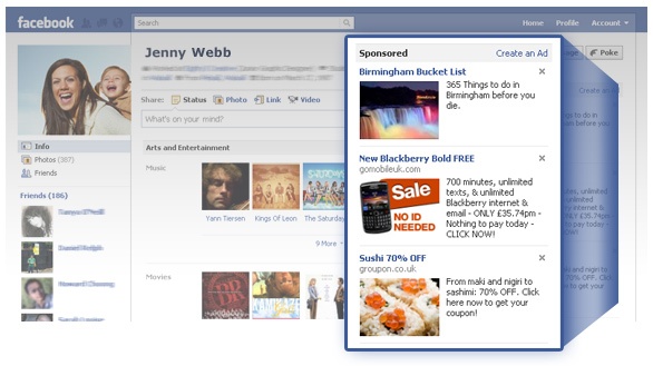
Facebook is one of the fastesed growing online social media platforms. the website offers a wide spectrum of platforms for people to connect with others. from games, adverts chat groups and emales.

from a advertising point of veuw they is great scope for advertising, this could be posting affemarets on friends fees or as a email even on a friends or other peoples Facebook pages. this is a good way of advertising small family company s or small start up company.

other way that big company's can advertise using Facebook are pop up ads, this can be realy effective way of advertising because if made realy eye catching a portentual customer might purchase something from the company.

the pop up ads also make an appearance on Facebook games this is a relay good way of advertising due to the fact, it altomatacly catches you attention. this can be in a form of a pop up ad or a video that an not be skiped.

i thing this is a good way of drawing attention of the public. this is because before they are playing there games. they are drawn to the attention to the company's adverts, not by chose. ofter the adverts cannot be skiped so instead they have no chose but to watch.

after watching the advert the are more likely to be curious about the product. this in turn is more likely to make the person visit the retailer or website. this could then drum up more custom for the company's.