Friday, 27 November 2015

70s cig adverts

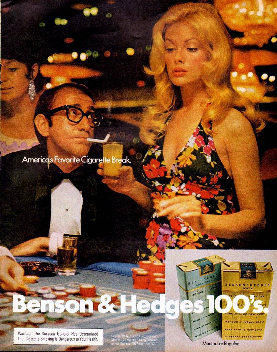
The looking back on cigarette adverts:

$(KGrHqF,!rcFHClCZFMMBR1EevGY0Q~~60_57

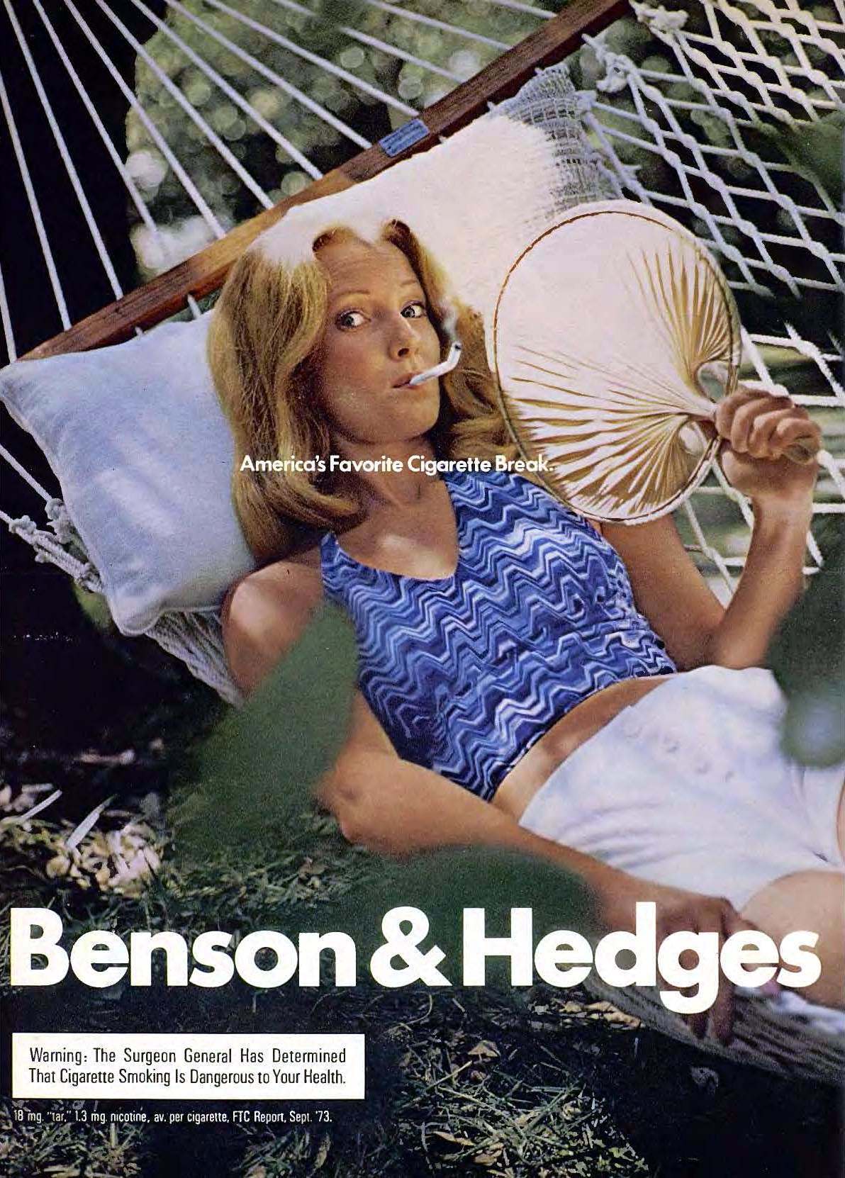
Although these adverts look rely eye catching, back in the day. they did reveal a small health warning. the days when smoking was ma-by a bit more socially exceptabul. the dangers of smoking were just coming out.
April 1974-3

The eye caching adverts would have convinced people that smoking was cool, easpeshaly when using holiday tiype background to promote the brands of cigarettes. but as the years have gone on smoking is not cool, bur highly addictive and as my other two blogs: one of image of a cigarette campaign and THE SECOND CAMPAIGN FOR SMOKING .illustrate that smoking, is dangerous and nower days. The government are doing there level best to put people off smoking, or if not a smoker then put them of starting.

i do like the camping back from the 70s, for that era it was relay good. but know that it has been have established, scientifically that smoking will and can kill its not a good add, in that respect.

SECOND IMAGE FOR SMOKEING CAMPAIN

THE SECOND CAMPAIGN FOR SMOKING:


From my first blog (one of image of a cigarette campaign), this campaign is a lot more servier. this one rely gets the message across. the visual is telling the viewer exactly what the literature is saying. the visual and text are working hand in hand to portray a rounded campaign to put smokers off smoking.

 this is why i think it makes a good campaign. the image is spot on it is showing thick blood coming out of the end of the cigarette, this is what it state on the other side of the campaign. i would say this is an mirrored imaged campaign. the image tells the viewers the imagery of what the text is saying on the other side, this is the other thing that i like about the add campaign, this is probably one of the major thins making the add so successful.

one of image of a cigarette campaign

The cigarette campaign 


This image is not nice, its a fact of what could happen to smokers. Looking at this as an advertising image point its good because it sends the message out. it points out the importance of not smoking. the image screams out don't smoke or this is what your insides will look like over time.

the image is self explanatory, there for the viewer of this advert knows what the campaign is advert campaigning about. they can then make their minds up about smoking.

i like this advert because it ex-planes in a visual sense what the campaigner is about. they is litterateur on the image but even if you took that away the viewers would know what the campaigner is about.

web sight argos blaack friday

the website prepare for sale:


this is a plain but yet very effective way of promoting the black Friday sale. they have frozen the website for a bit. by using this make i memorable for the consumers, they will remember this and there for more likely to re visit the sight latter when the retailer has reopened.

i like this because the circles make the whole page stick out, the couleration is nice and the layout is in proportion. the font used is clear white on black work well together. the whole page over all is clear and remmberable for the consumer.

Wednesday, 18 November 2015

# MINI car add

Mini print based advert:


We all know that mini has been an iconic brand of car for years. So the simple but eye catching print based add, that they have produced is really nice. This advert is really simple but also effective, its fun too look at.

The image of the car upside down is really eye catching an draws your attention, this I would say was the iconic part of this advert. The choose of simple text is really good and easy too read. With the mini logo in the corner is a nice touch. We all know that the add id advertising a mini, but if you have never heard of this car brand you do, due to the logo on their.


The grey boarder makes the whole advert rounded, makes it stick out more. The two contrasting colours black and grey go really nice together.

Global Warming

Global Warming:


 best print ads

Sidderth Basaveraj and Vinay Saya have produced this print based add for global warming. The cleaver use of illustration, they have used ice as the sky, to get the message of the coldness. The image as a hole cleverly make the person think of the subject and want to act upon it.

This add has a good use of imagery and colour which will attract a person or a crowd to look at the advert, this will make them think off the subject. When the have had chance to register their forts they are more likely to act on the fought, due to the message been portrayed through the advert.

The subtleness of the logo and typography is really good, it not to intrusive. The viewer has the opportunity to read it if they want. This blends in well with the image, not distracting or beaning in the way of the advert itself. 

#Obesity Ice cream


Obesity Ice cream add:

creative ad in 2015

This add is a print based campaigning was produced, for the obesity of children. The French Ministry Health got this add produced to cover this issue. The person who produced the ad campaign was David Lesage.
  
The fact that an ice-cream has been used to demonstrate obesity in children, is an eye-catching way of portraying this. The pastel colour of the purple, with the pale yellow cone work really well. The colors will attract a lot of attention, this will effectively get the message across.

Patterning on the cone will make for vernation on the whole image and break it down. This also makes it eye catching. The suitableness of the message at the bottom of the add still gives power of the message the add is giving. But not in an in your face kind of way. They have bearded this in mind, due to the fact that the target audience is the parents of the kids.

The ice-cream its self-forms a belly button on the top. This I think is a well-balanced and well-rounded way to portray obesity in children. Ice cream is fattening, and kids favorite food is ice cream. With this info in mind, makes a very successful campaign add.  

Tuesday, 17 November 2015

Breakfast in Hotel B AND B (cool) add

Breakfast in Hotel B AND B :


B&B Hotels Ad

This well created and good use of art direction to create a advert for B and B Hotels, was created by Publicis a German advertising company. this advert is rely cleaver, the image of the bed with an image of a cooked breakfast on top.

the image as a whole would intiseses the customer to stay with this hotel. The advert on the hole is straight to the point, ith minimal color and good choose of back ground. white is a good choose because it show the rest of the image up realy nicely and there for rounds the whole advert off nicely.

Fries of McDonald's Add:

Fries of McDonald's:

McDonalds Potatoes Ad

This advert for McDonalds was created by TBWA in shanghai. The advert is advertising the fast food chains biggest selling item, a carton of fries. They used a potato to carve this item, which is illustrating what fries are made from. This is very clever and consisted way of advertising.
 The image looks very pleasing to the eye, to shoppers around the city who are hungry.

 This advert may just make them hungry, wanting them to eat. They would probably go to Mc Donald’s for food. The fact is the image looks really life, it looks good enough to eat, and this in turn entices potential custom for the food retailer. 

This image is pleasing to the eye only using simple pale, yet very effective coloring. This is just right and not over powering. The balance is right and their for gives you the feeling of you interacting with the fries. 

Fanta cool add

fanta print add:


Fanta Ad

This amassing print add produced by OgilvyOne, he produced this in Dubai. This is an amassing peace of advertising that catches the attention of the commuters and passers-by. This advert is likely to draw the viewers into buying into the brand. The variety of different type typography, happening make you want to by a drink of Fanta.


 This advert cannot be mist due to the bright orange background and the ever changing typography. The slogan its self-interacts with you when you read it, this in turn make you want to buy into the brand. This advert would work in the summer months due to the popularity of cold drinks. The brightness of the orange screaming out summer flowing the mix of typography and the powerful slogan makes you feisty and wanting to purchase a can of the drink.

Thursday, 12 November 2015

The banner for Coca-Cola:

The banner for Coca-Cola:


The use of two colors are good. The white banner is really good. The use of the fists that link up are really good. This breaks up the banner. The distinctive banner looks really good, you can tell that its Coca-Cola. The fact that the brand has not used typography on the advert, you can still identify the brand. This is due to the fact the brand is a globule brand. I think the contrasts of colors work well together because of the crispness of the white and the brightness of the red. This makes it eye catching and will catch the attention of potential clients.

Wednesday, 11 November 2015

oasis drink add take 2:


oasis drink add take 2:


Good use of typography for this oasis advert. This in turn makes it easy to read from a distance.  This poster is effective and eye catching billboard. I like the background splashes, this gives depth and corrector to the advert.  I like the fact that there are two towns of red working hand in hand, too make a more eye catching platform. . I like the fact that there is only a few colour’s used, this is because it does not make the advert to complex. This in turn makes it easy to read from a distance. On the whole the whole advert is more focused on the drink it self rather than the whole advert. This puts more focus on the drink which will make consumers buy into this brand.  

Oasis add: made for drinking:

Oasis add: made for drinking:


This is a simplistic but effective and eye catching billboard. The advert captures the moment and makes you want too by oasis. The type fount is simple but easy to read, even from a distance. I like the fact that there is only a few colour’s used, this is because it does not make the advert to complex. This in turn makes it easy to read from a distance. On the whole the whole advert is more focused on the drink it self rather than the whole advert. This puts more focus on the drink which will make consumers buy into this brand.